Fontastic

I’ve got a demo going of the SMuFL font thing here. This is what my style.css looks like:

@font-face {
  font-family: Bravura;
  src: local("Bravura Regular"),
    local("BravuraRegular"), 
    url(Bravura.otf) format("opentype");
}
 
body {
  font-family: Bravura, Sonata, sans-serif; 
}

td {font-size:200%;}

I cheated. Instead of writing the script to generate all the glyphs in javascript, I used sclang because I know it already. This is the code:

i = 0x1D1FF - 0x1D100 + 1;

"<html>".postln;
"<head>".postln;
"<link rel="stylesheet" type="text/css" href="style.css">".postln;
"</head>".postln;
"<body>".postln;
"<table border =1 cellpadding =5>".postln;

i.do({|glyph|
 // unicode music section
 glyph = glyph + 0x1D100;
 "<tr><td>%</td><td>&#x%;</td>".postf(glyph.asHexString(5), glyph.asHexString(5));

 // SMuFL extra music char section
 glyph = glyph + 0xE000 - 0x1D100;
 "<td>%</td><td>&#x%;</td>".postf(glyph.asHexString(5), glyph.asHexString(5));
 glyph = glyph + 0xFF;
  "<td>%</td><td>&#x%;</td>".postf(glyph.asHexString(5), glyph.asHexString(5));
 glyph = glyph + 0xFF; 
 "<td>%</td><td>&#x%;</td>".postf(glyph.asHexString(5), glyph.asHexString(5));
 glyph = glyph + 0xFF; 
 "<td>%</td><td>&#x%;</td>".postf(glyph.asHexString(5), glyph.asHexString(5));
 glyph = glyph + 0xFF; 
 "<td>%</td><td>&#x%;</td>".postf(glyph.asHexString(5), glyph.asHexString(5));
 glyph = glyph + 0xFF;
 "<td>%</td><td>&#x%;</td>".postf(glyph.asHexString(5), glyph.asHexString(5));
 glyph = glyph + 0xFF;
 "<td>%</td><td>&#x%;</td>".postf(glyph.asHexString(5), glyph.asHexString(5));
 glyph = glyph + 0xFF;
 "<td>%</td><td>&#x%;</td>".postf(glyph.asHexString(5), glyph.asHexString(5));
 glyph = glyph + 0xFF;
 "<td>%</td><td>&#x%;</td>".postf(glyph.asHexString(5), glyph.asHexString(5));
 glyph = glyph + 0xFF;
 "<td>%</td><td>&#x%;</td>".postf(glyph.asHexString(5), glyph.asHexString(5));
 glyph = glyph + 0xFF;
 "<td>%</td><td>&#x%;</td>".postf(glyph.asHexString(5), glyph.asHexString(5));
 glyph = glyph + 0xFF;
 "<td>%</td><td>&#x%;</td></tr>n".postf(glyph.asHexString(5), glyph.asHexString(5));
});
"</table>".postln;
"</body></html>".postln;
"";

It’s not the nicest code I’ve ever written.
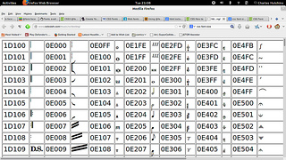
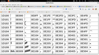
If you click through and see musical stuff at the top of the first two columns, then all is well. If you see non musical stuff, like linux penguins, then the font thing didn’t work. This is what it looks like for me:
.flickr-photo { border: solid 2px #000000; }.flickr-yourcomment { }.flickr-frame { text-align: left; padding: 3px; }.flickr-caption { font-size: 0.8em; margin-top: 0px; }


Bravura in Firefox, originally uploaded by celesteh.

If you’re getting something really different, if you don’t mind leaving a comment about your browser and operating system? This is supposed to work with internet explorer, so I’m interested in the experiences of Windows users and especially of iPad users.
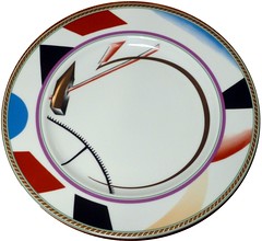
I mentioned yesterday that I was drawing some influence from Russian art of the revolutionary period. This is a picture of a plate originally designed around then:
.flickr-photo { border: solid 2px #000000; }.flickr-yourcomment { }.flickr-frame { text-align: left; padding: 3px; }.flickr-caption { font-size: 0.8em; margin-top: 0px; }


Supermatist Plate, originally uploaded by celesteh.

It’s got a nice mix of abstract and concrete symbols. Also this google search returns a load of suprematist images. There seems to be a clear relationship between those kinds of images and some of Schaeffer’s colour pieces, which are single page graphic scores.
The next steps for me, aside from getting some javascript skills, are picking which of those many many many musical symbols will be in my palette. I can’t just pick randomly within the range, because some of them would be especially nonsensical (like the MIDI cable ones) and not every glyph is supported.
Also, I still need to pick out some text.
Sketches

.flickr-photo { border: solid 2px #000000; }.flickr-yourcomment { }.flickr-frame { text-align: left; padding: 3px; }.flickr-caption { font-size: 0.8em; margin-top: 0px; }


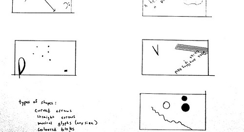
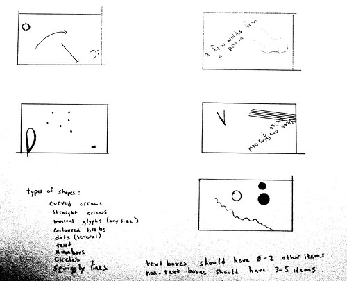
Sketches, originally uploaded by celesteh.

I finally did some sketeches with pen and pencil about what I might do. The gamut of allowable shapes is therefore:

  • curved arrows
  • straight arrows
  • musical glyphs of any size (a list of allowable unicode numbers will be forthcoming)
  • coloured blobs
  • clouds of dots
  • text
  • numbers
  • circles
  • squiggly lines

Boxes that contain text may have 0-2 other items. Boxes that do not contain text may have 3-5 items.
A few of the boxes I drew reminded me of some of the Russian avant-garde stuff, like the Constructivists and Suprematists. This is not a co-incidence since, inspired by the name of my choir, I went to see a bunch of Constructivist work some weeks ago. I’ll post some of the images I’m thinking of shortly.
As far as text goes, I had an idea to use some incantations of C’thulu, but then I realised that’s a terrible idea, so I’m thinking now of some English translations of Constructivist and Suprematist poetry or prose, still about sounding and listening.

OSC and Javascript

Having my mouth cut open took a bit more out of me than I expected. I have nothing new to share about rendering graphics with font symbols in javascript, but here are some js libraries that can do OSC, which will be needed for a later stage of this project. I was looking these up for another project that needs to both send and receive OSC. I don’t want to have to learn two different OSC libraries, so even though this project only needs to receive, I’m only interested in libraries that do both. All of these seem to be built on top of another library called Node.js

  • Kievii does a lot more than I need, but there’s OSC in it too.
  • OSC-web has some proxy stuff which could be useful for later projects
  • OSC-min is a minimal implementation that does everything I need
  • The website for Node.js has a list of popular OSC implementations

Back to rendering graphics soon. I’ve been reading an introduction to javascript, which is way too basic, but a place to start. After that, I think what I need to know about is probably canvas, so I’ll be reading about that.
Also, obviously, I need to think about symbols that are not just bits of music notation font. If I also want to use text, I either need to write some or find something that I can use, such as a philosophical text or poem. If I want the text to be related to the mechanics of the piece, it should be about sounding and listening. There’s some odd text on this theme that I remember from the very start of Noise Water Meat, so I might go looking for that in translation. I really do need to make some paper sketches soon or there’s a risk that I’ll just be making a real-time, machine-listening, pastiche of Redhead and while that would be great fun, I do want to make this my own.
I’m also sort of wondering how I want to page changing to work. Do I want the boxes to just fade in and then fade out? Do I want them to move their location on the screen? Do I want them to change size? Should the elements within them stay fixed? I’m thinking that if the box is moving or changing size, the stuff in it can’t also move or it’s too much.

Creative Pact Day 3

So I’m doing the Creative Pact, but I’m a day behind because I didn’t hear about it until September 2nd. My project is to write a vocal piece wth a computer generated score in real time.
I don’t have a lot to report today. I learned some facts:

  • There is a new release of SCMIR
  • It is totally possible to serve fonts across the web for viewing web pages. You use a thing in CSS called @font-face
  • There is a new initiative for standardisation in music fonts called SMuFL (pronounced ‘smooful’). Compliant fonts implement the unicode section for music fonts and then have a bunch of additional musical symbols.
  • The font that ships with LilyPond, Bravura implements SMuFL and looks alright.
  • (The tattoo on my arm is bass clef in the font that shipped with Sibelius 3. What font is that?)

I can’t do a proper demo of this because fonts included in a web page need to be served from the same server as the webpage (at least for firefox users), but this style.css bit sets the font to Bravura for the whole of a webpage:

@font-face {
  font-family: Bravura Regular;
  src: local("Bravura Regular"),
    local("BravuraRegular"), 
    url(Bravura.otf) format("opentype");
}
 
body {
  font-family: Bravura Regular, Sonata, sans-serif; 
}

That uses the local copy of Bravura, if it’s already on your machine, or downloads it if not. If somehow that goes wrong, it uses the Sonata font instead. When I get a chance, I’ll upload a proper demo to my website, doing a table of all the musical symbols. But probably not tomorrow, as I’m going ot have dental surgery in the morning and will probably feel rotten later in the day.

Working from home

So this is day 2 of the creative pact thing in which I try to work from home on my gf’s day off from work. Alas, I have no sketches to upload.
Paper graphic scores can either be single page or multi-page. Bogusław Schaeffer’s colour pieces, Anthony Braxton’s Falling River pieces and Carl Testa’s squiggles are all examples of single page pieces that work well. When I’ve done these pieces, performers have either taken the page as a whole, or picked different spots on the page to concentrate on. (I only saw very early versions of Testa’s pieces, so his instructions may have become more directed since then.) This interpretation has not required things be done in any particular order. Someone might start with a set of symbols or notation at the bottom right, then go on to the top left, then do something outline a large shape across the whole page.
Some good multipage scores are, obviously, Cardew’s Treatise and also Lektura by Schaeffer and Concerto by Lauren Redhead. Because these pieces progress regularly from one page to the next, a certain tendency towards chronological order is introduced. The pages therefore seem to need a structure that holds them together and allows them to progress. Schaeffer and Redhead use boxes. Their pieces are also divided into parts. So the performer can look at a box, know whether or not it belongs to them and know it’s timing relative to other boxes other people are interpreting. The box itself seems to be often taken as a whole, with performers able to decide on whatever ordering seems to make most sense in context. By contrast, Treatise is not in parts and the entire ensemble reads from the score, on the same page at the same time. His pages are held together by the ‘lifeline.’ This is a horizontal line across nearly every page that performers can orient themselves along. Mark Applebaum’s Medium is a multi-part piece that does not have a consistent structure, but even it has the vertical ordering of parts and many parts do have something lifeline-like. Some sort of line or box structure seems to be extremely helpful to performers of multi-page scores.
My piece will be on a single, changing screen, which I think makes it more like a multi-page piece than a single page piece. It will be a non-divided score like Treatise. My intention at the moment is to devise a gamut of symbols and then put those symbols in boxes, like Schaeffer or Redhead. Some of these symbols will be based on existing musical symbols, but in differing contexts. They may also be rotated within the bounding boxes, like Redhead.
Because this will be in javascript, I need a way to render them in a web browser. Rather than work out exactly how to draw a notehead in code (yikes), this situation seems to call for a font-based solution. I have not yet worked out what musical fonts I can count on to be available, but I have found the unicode specifications for musical symbols in fonts and how to represent those in HTML. Also, should you wish to type a unicode symbol on an ubuntu computer, you would first hit ctrl-shift-u and then type the hex code and then a space. So to type a bass clef, hit ctrl-shift-u 1D122 space. I have no idea what application this might have, but there you go.
What I’m imaging will happen is that the program will render an image using lines and curves and polygons, some musical font stuff and some text, then rotate that image some amount from 0-360 degrees, then clip it to a bounding box, then draw the clipped portion on the screen with a black outline around it.
I pondered putting a web server on the main, listening computer, in order to get it to render the images. It could then tell the clients to download and display them in the proper place, which would make sure everybody was doing the same thing. This might be the right idea, especially if I want to use one of LilyPond’s music fonts, which I spent too long trying to find on my system. Right now, though, it seems like an extra layer of work that hopefully I can avoid.
I’ve upgraded to the latest version of processing and downloaded the javascript and coffee script modes. The next step is to read the quick start guide for folks experienced with processing.

Picking a Graphics Library

There’s some Creative Pact thing that people do for the month of September. I’ve decided that I should work on my commission for the Vocal Constructivists. I’m going to generate some graphics notation for them. When I say ‘generate,’ that’s pretty literal. My plan is to computer generate graphics notation in real time, in response to computer listening to what the choir is doing, so as to create a feedback loop of sorts.
Obviously, there are a lot of parts for this. I have some vague ideas of how to do the listening (SCMIR and some other feature extraction with SuperCollider). But as this is a feedback loop, there’s also a question of how people will tend to respond to various notation, so I’m starting with the notation aspect first.
There have been some very interesting live notation projects I’ve seen. They often use LilyPond as the rendering engine. There are some SuperCollider libraries that interface with this system. However, the Constructivists are more about graphic notation, so unless lilypond lets you disassemble notation symbols like Cardew’s Treatise, it’s not quite what I need. I really need a vector graphics library that I can communicate with via OSC.

Practising and Performing

The LilyPond stuff works really well because the notation is already very widely understood. There are a lot of ways a performer can interpret a crotchet on B-flat, but the pitch and duration are already set, at least, Other dynamics markings, phrase markings, etc give a lot of data to a performer. In essence, the perofrmer has thousands of hours spent already learning the notational symbols. Many or most of these elements may be absent or modified in graphical notation. Therefore, a performer of a graphical score must learn the notations they learn the piece. If the notation is changing in real time, this sets up a serious issue as to how they should practice.
There’s a chasing-one’s-tail problem with feedback loops, so for now some set process will generate the notation. Performers need to be able to see the notation while they practice and perform. This implies that either I’ll need to create some static printed sheets, which are in danger of beocming a fixed score, or else I need to be able to send notation to the laptops, tablets or other devices that they can then take home with them and look at.
I was considering using Open Frameworks or Cinder, but there are some issues that prevent this. These issues are political, not technical. And they have to do with Apple, who have deicded that free software is not welcome on their platforms. A tablet is exactly the form factor that’s needed, but as the real owner of all iPads is Apple computer, who sees fit to dictate what consumers can do with something they spend a small fortune on, I’m out of luck unless I want to write multiple versions in multiple languages and pay a fee to Apple for the privilege of wasting my time. So I’m going to have to do it in javascript.
If anybody is wondering why javascript is so popular right now, the answer is because Apple are wankers.
Right, ok, I hate javascript and I hate browser plaforms but sometimes art forces one to gaze down into muck so as to better appreciate the stars overhead. Anyway. So there’s a version of Processing for javascript, which I’m leaning towards because I’ve got some processing experience and there is a lot of documentation. Alas, somehow processing in the past has had the power to make even single rendered lines look ugly. But you know, sometimes you need to trade off things like aesthetics and performance and joy in life to make some Silicon Valley billionaires happy.
If I want to try something new, there are actually quite a few javascript vector graphics libraries on offer. One seemingly popular one is called Raphaë1 and then there is one with fun demos Bonsai and then one designed for ‘creative coding’ called Sketch.js, (which works with Coffee Script, which seems to be less painful than normal java script) and then there’s the very old school looking JSGL. I have no idea which one to use.
I’m hoping somebody gives me some suggestions, but barring that, Processing has a lot of documentation and a large user base. Also, since this is a piece for performers, I’d like it to have a longer self-life than I would expect out of a purely digital piece. If people are going to go to the trouble of learning it, they shouldn’t be forced to abandon it before they’re ready.
So my next task is to dig out my art supplies and start sketching out ideas. What might a snapshot of the notation look like? What are elements on the page and how might they transform?